Branding visuals for virtual agent

Initial concepts and kick-off for the new virtual agent being used on the HP Support website. Research, design of avatar and initial style guide completed by myself working with the Artificial Intelligence (AI) team from Microsoft, to understand early limitations.
FOR
ROLE
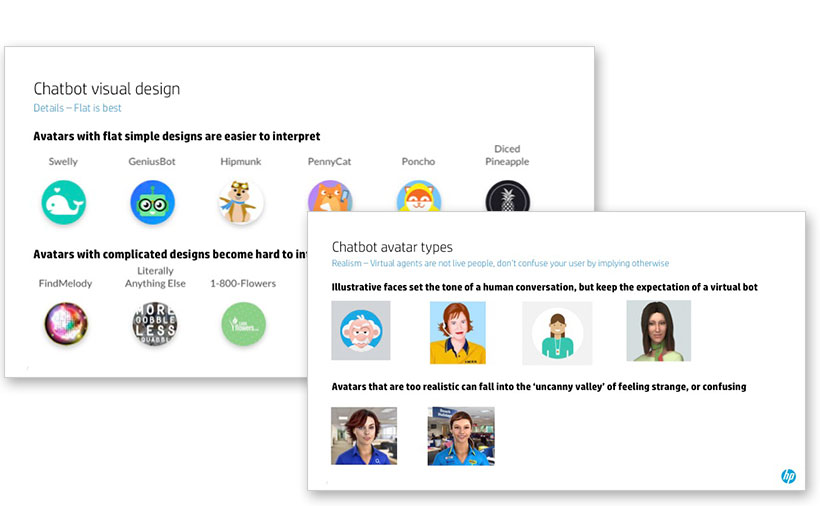
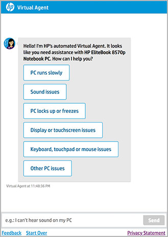
Competitor research was done to help decide what type of avatar we wanted for our virtual agent. We ultimately decided that because we are support focused, we wanted to use an illustrative face to give the expectation of conversation, without feeling too realistic, since it won’t be a live agent.
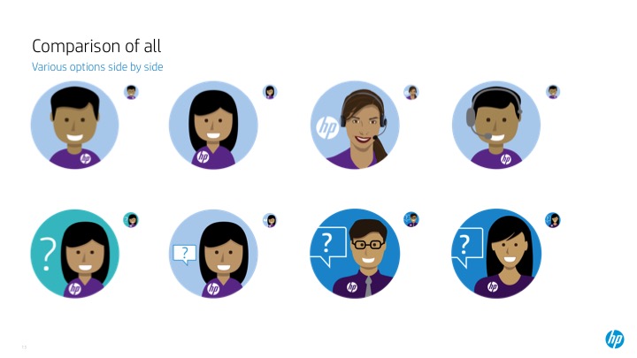
As a global company, we wanted to make sure our virtual agent looked friendly, approachable and had a non-specific ethnicity. I played with many variations, using the both the shape of HP’s ‘person’ icon, and also more realistic versions. We wanted the idea of both ‘HP’ and ‘help’ to come across, and did this with various question mark and chat icons. Ultimately the leadership team leaned towards the less cartoonish, yet non-realistic female as their favorite.

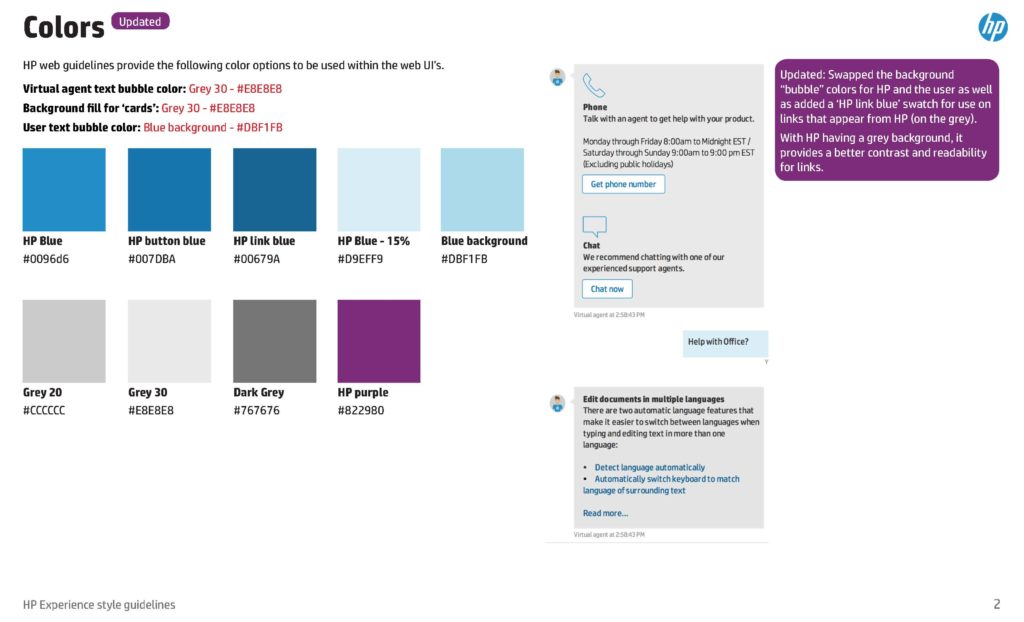
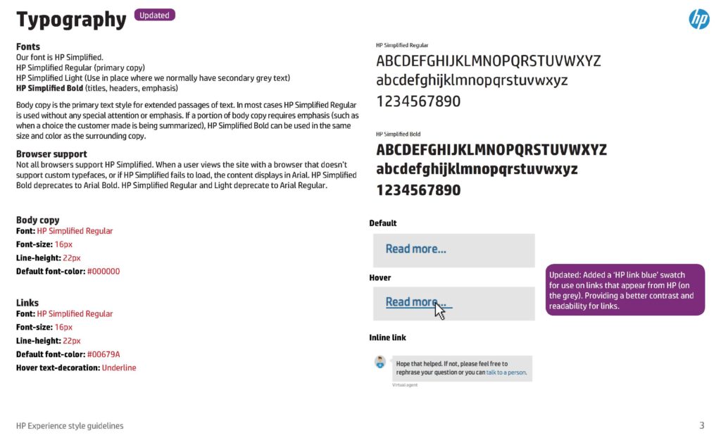
Using our company wide brand standards and (for sake of easy updates) as many of the out-of-the-box features of the Microsoft tool, I defined specific branding to the chat bot. Font hierarchy, icon colors and treatments, conversation links and options and all interactions were defined and documented within a style guide document to be shared with the development and QA teams.
I partnered with the Microsoft and HP development teams to provide guidance and testing to verify all of our use cases were met for the initial release.

SCL_map")


