HP Style Guide
Expanded on basic guidelines provided by company branding (colors, typography, buttons) to create full style guide for use across our support web, sales web side and on-product application team.
FOR
ROLE
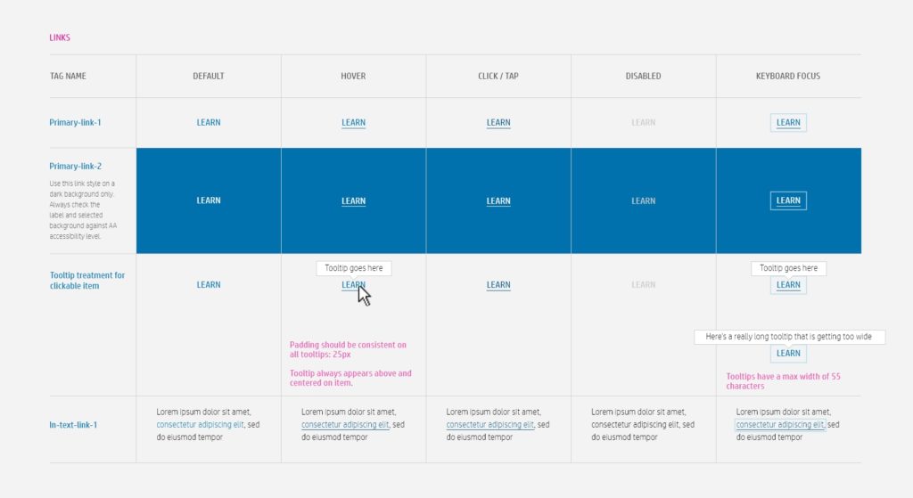
Basic button and link guidance was provided from branding, but was not expansive enough to cover all of our use cases. Hover states, in-line hyperlinks and more specific uses were added.
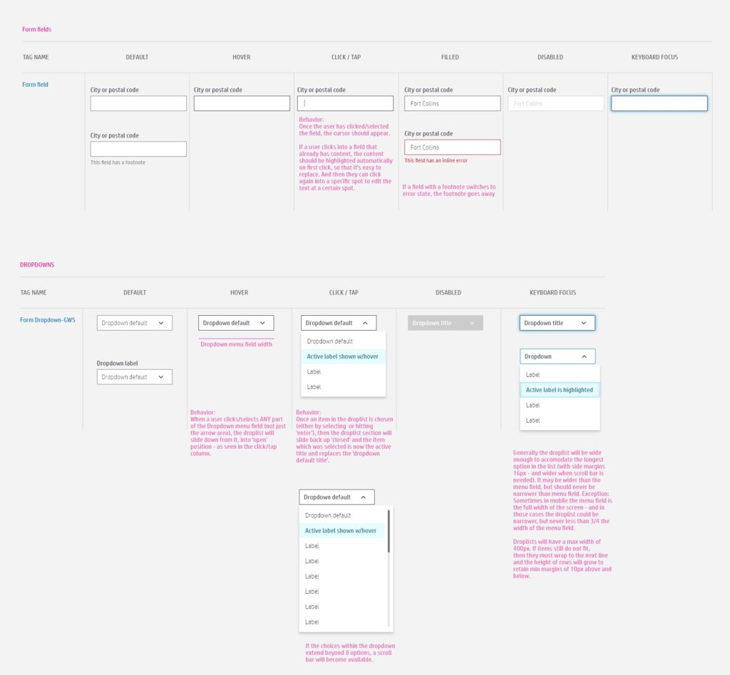
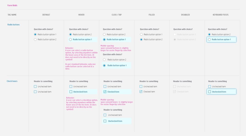
For the support side of our web site, form fields play a big role and we defined new, more user-friendly fields with accompanying drop-down menus, checkboxes and radio buttons.
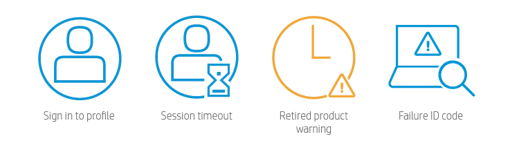
Additions to iconography was also needed, as most were created for the sales side and not the needs of support. These icons were created on a as-needed basis, and shared with the other support teams to ensure consistency in both look and usage.
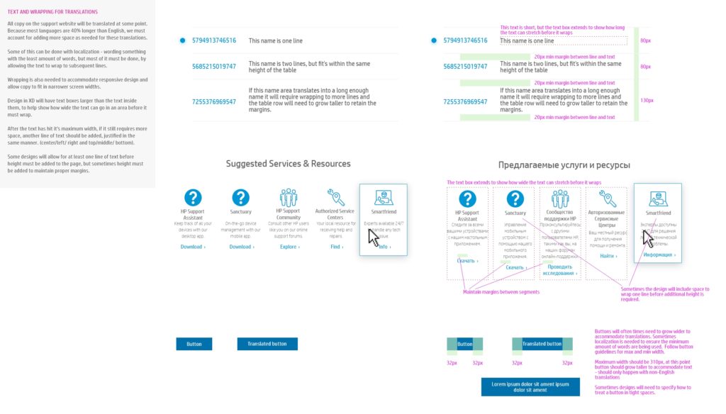
Both the design and development teams were new to working with XD and Zeplin for redlines, so we extended our style guide to help define how translations for the 24+ languages on our site would effect the format of the designs we handed off.

SCL_map")


