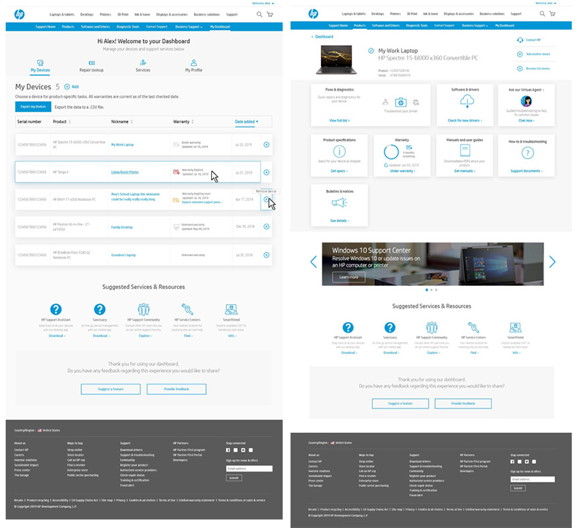
Personalized dashboard
As the lead web designer I helped to test, design and create a personalized dashboard for the return user at the HP customer support site. Working with another group within the company we teamed up with an agency to help create consistency across our website, desktop application and mobile app. Together we ensured a consistent personalized user experience across all three platforms while also providing unique offerings related to our part of the project.
FOR
ROLE
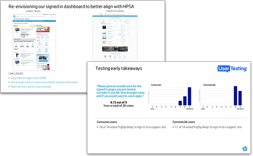
Having created a basic dashboard to meet stakeholder deadlines, we had current user data and a live experience to test against our early designs. I created clickable prototypes and multiple screen variations to run several usability tests through UserTesting.com. These tests were used to compare experiences, find missing user needs, rate usability and success rate of common tasks, determine user preferences and verify some of our assumptions.
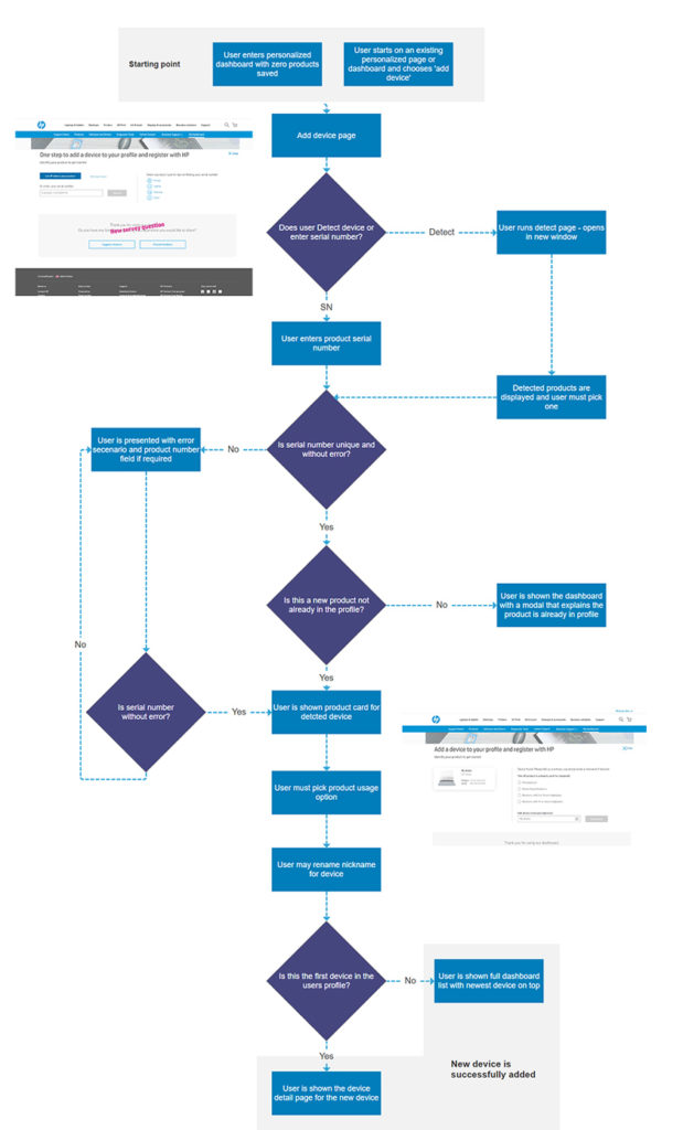
Improved flows, such as ‘add device’ were created first as visual charts to map the journey (and possible forks) the user could take to successfully complete the process. These flows are used to visualize journeys in stakeholder reviews and to find technical limitations or gaps when we need to connect to older backend systems.
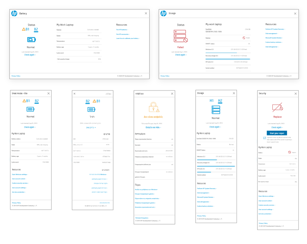
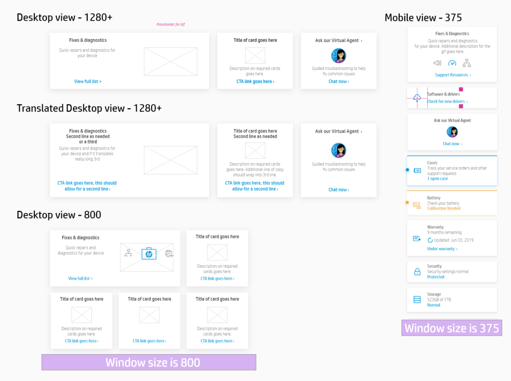
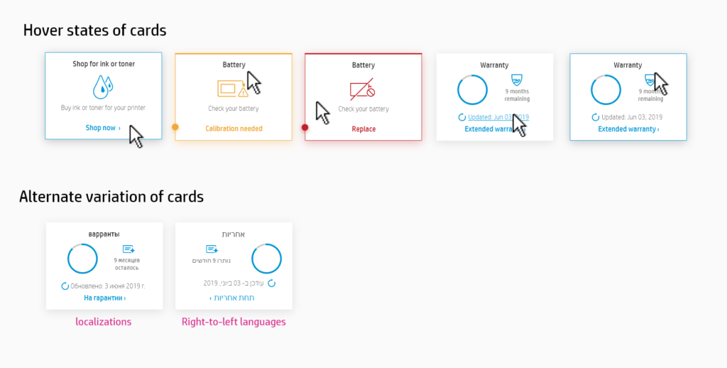
After main screens were created, variations of all UI components had to be made to accommodate responsive screen sizes, language and localization requirements (including left to right layouts), various error states and hover states.
I worked with the project manager to add interaction requirements to the JIRA stories and verify that all acceptance criteria had been accounted for. Story acceptance testing (SAT) happened after sprint cadences had finished and had been demoed and I provided User Acceptance Testing (UAT) once entire development cycles were set to launch.
In the end we created an experience that met our company and user needs; aligning with the experience seen within our apps, providing more value props and reasons to create an account while improving our NPS score on the dashboard itself.

SCL_map")


